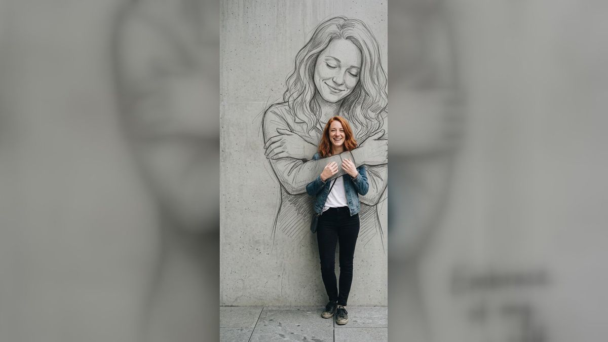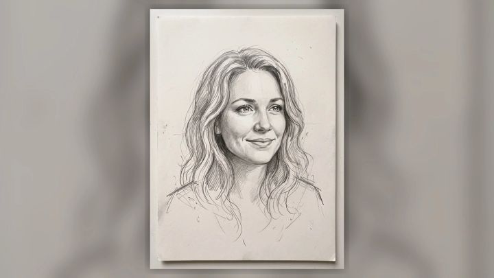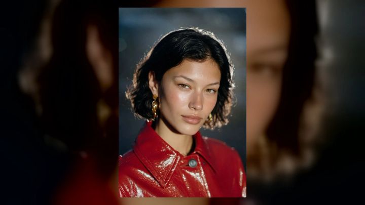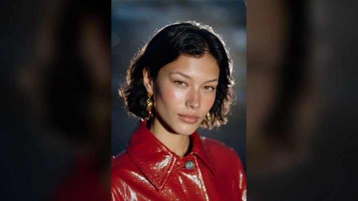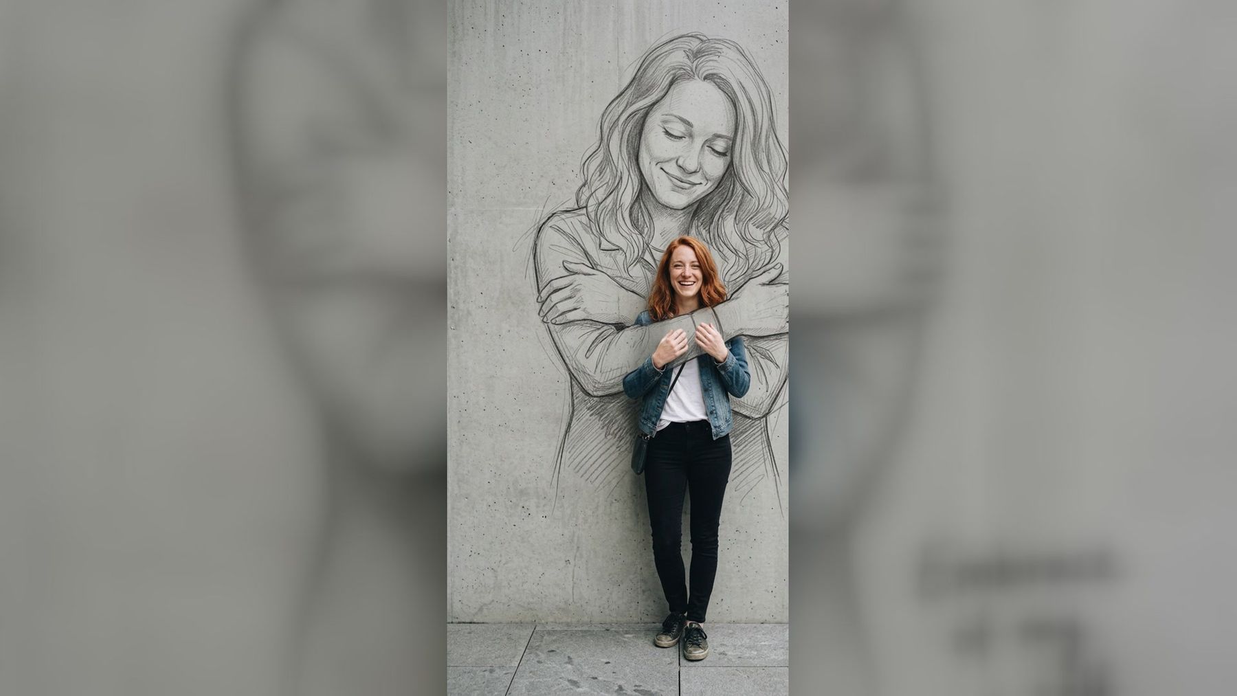
Turning a photo into a pencil sketch works best when you treat it as a new composition, not a gray filter. Start with a clear subject, simplify the background, preserve the features that make the person recognizable, and choose a sketch style that suits the final use. For a ready-made version with a more imaginative composition, the Self Hug Sketch trend places a color portrait in front of a giant wall drawing that appears to hug the subject.
That effect illustrates an important point: the most memorable photo-to-sketch images do more than trace edges. They create a relationship between photographic detail and drawn marks. This guide explains how to choose a source photo, decide between a full conversion and a mixed-media look, write better editing instructions, and fix the problems that make generated sketches feel flat or generic.
The short answer
To turn a photo into a convincing pencil sketch:
- Choose a sharp, well-lit image with a readable silhouette.
- Crop around the subject before applying the effect.
- Decide whether you want graphite realism, loose line art, charcoal, or mixed media.
- Tell the editor what must remain recognizable.
- Simplify distracting backgrounds and accessories.
- Generate at a size and aspect ratio that match the destination.
- Review the eyes, hands, hairline, clothing edges, and shadows.
- Make one focused revision instead of changing the whole brief.
- Upscale only after the composition is correct.
An AI workflow can do much of the rendering, but the source image and art direction still determine whether the result looks intentional.
What “turn a photo into a pencil sketch” can mean
Search results often group several different effects under one label. Knowing which one you want makes the instructions clearer.
Full graphite conversion
The entire photograph becomes a monochrome drawing. Skin, hair, clothing, and background are translated into lines, hatching, and shaded graphite. This style works well for keepsake portraits, editorial illustrations, and printable art.
Clean contour drawing
The image is reduced to outlines with little or no shading. It can resemble a fashion illustration, coloring page, tattoo reference, or minimal profile graphic. A contour result needs strong edges and a simple source image because there is less tonal information to separate overlapping forms.
Charcoal portrait
Charcoal uses broader dark masses, softer transitions, and visible smudging. It feels more dramatic than a precise pencil drawing, but fine facial details can disappear if the shadows become too heavy.
Mixed-media portrait
Part of the image remains photographic while another part becomes a drawing. The self-hug composition is one example: the foreground subject stays in color while a large pencil version appears behind them. Mixed media can tell a clearer story than a full conversion because the contrast between real and drawn elements becomes part of the idea.
Hand-drawn headshot
A head-and-shoulders portrait is converted into a controlled illustrated likeness. If that is your goal, the hand-drawn sketch portrait style is a closer starting point than a full-body mural effect.
Choose a source photo that will survive simplification
A pencil sketch contains less color information than a photograph, so the structure of the image has to do more work. The best source is not necessarily your most polished selfie. It is the one whose pose, lighting, and outline remain understandable after color is removed.
Use clear, directional light
Soft light from the front or slightly to one side gives the face enough shape without burying the eyes. Avoid a bright window directly behind the subject unless you specifically want a silhouette. Deep shadows can become empty black patches, while flat overhead light can make the face feel featureless.
Keep the face large enough to read
A person occupying ten percent of the frame may look fine in a travel photo but lose identity after conversion. For a portrait, the face should remain visible at thumbnail size. For a full-body composition, use a high-resolution original and avoid placing the subject too far away.
Look for a clean silhouette
Hair, shoulders, arms, and clothing should not merge into a similarly colored background. A dark jacket against a dark wall creates ambiguous edges even before the sketch effect is applied. If the background is busy, isolate the person with the background remover before building the final composition.
Avoid accidental obstructions
Hands covering the face, oversized sunglasses, harsh phone shadows, and objects crossing the body give the editor less reliable visual evidence. Accessories are fine when they are part of the idea, but each one adds another shape that must be interpreted correctly.
Use an original file when possible
A screenshot from a social app may already contain compression, sharpening, text, or interface elements. Start with the camera original or the cleanest export available. Repeated downloads can turn hair, eyelashes, and fabric texture into blocky artifacts that a sketch effect may exaggerate.
Crop for the destination before you generate
Aspect ratio is an art-direction choice, not an export detail. A vertical story, square profile image, landscape blog hero, and printable portrait all need different breathing room.
The Self Hug Sketch experience produces a vertical 2:3 image from one full-body or waist-up photo. That ratio gives the wall drawing room above and around the foreground subject. A tight square selfie would not leave the same space for the larger illustrated figure.
Use the image resizer to test framing before generation. Keep important facial features and hands away from the extreme edges. If the final design includes a large drawn figure behind the person, leave extra wall or background around the subject rather than filling the entire frame with the body.
Do not stretch an image to fit a new ratio. Crop it or extend the composition deliberately. Stretching changes facial proportions and creates a weak reference before the artistic transformation even begins.
Write instructions that describe materials and priorities
“Make this a sketch” is technically understandable, but it leaves too many decisions open. A better instruction separates what should change from what should stay fixed.
Use four parts:
- Subject: identify the person, pet, object, or group that matters.
- Preservation: name the features, pose, clothing, or expression that should remain recognizable.
- Medium: specify graphite, mechanical pencil, charcoal, ink contour, colored pencil, or another material.
- Finish: describe paper texture, line density, shading, background treatment, and overall mood.
A concise prompt starter might be:
Convert the portrait into a realistic graphite drawing. Preserve the face shape, hairstyle, expression, jacket, and pose. Use fine pencil lines, gentle cross-hatching, and visible paper grain. Keep the background minimal.
For mixed media:
Keep the foreground person photographic and in natural color. Create a much larger monochrome pencil version on the concrete wall behind them, using the same face and hairstyle. Let the drawn arms wrap around the foreground subject. Keep the wall simple and the composition vertical.
These are starters, not rigid formulas. Add only the creative variables your image needs. Long prompts can become contradictory when they specify multiple media, lighting setups, poses, and backgrounds at once.
A step-by-step workflow
1. Define the purpose
Decide where the image will appear. A profile picture needs a strong face at small size. A poster can support more texture. A social story benefits from vertical framing and a clear central action. A printable gift needs enough resolution for the intended paper size.
2. Prepare the photo
Straighten the horizon, remove accidental borders, and make a clean crop. Correct severe underexposure, but do not over-smooth skin or sharpen every pore. The goal is a readable reference, not a finished glamour retouch.
You can make focused corrections with the AI photo editor when the source needs a cleaner background, repaired clothing edge, or subtle lighting adjustment. Keep those edits realistic so the sketch reflects the person rather than a chain of artificial changes.
3. Select the sketch treatment
Choose one primary visual language. Fine graphite is controlled and detailed. Charcoal is broad and dramatic. Contour drawing is clean and graphic. Mixed media creates contrast between photography and illustration.
Do not request graphite, charcoal, ink, watercolor, and marker in the same pass unless you intentionally want a collage. One material gives the system a clearer target.
4. State what must not change
Preservation instructions are especially important for faces. Mention the expression, head angle, hair part, recognizable clothing, and body position. If a hand placement is central to the concept, say so explicitly.
For a group photo, identify each person by location rather than assuming the editor knows their names: “the person on the left,” “the seated subject,” or “the child in the red jacket.”
5. Generate one coherent version
Use the dedicated trend when its fixed composition matches your goal. On the current Self Hug Sketch page, you upload one JPG, PNG, or WEBP image up to 10 MB; a clear full-body or waist-up photo is recommended. The workflow uses Nano Banana 2.1 to keep the foreground face, hair, and outfit in color while drawing the larger version behind it.
This is a paid-credit generation, not a free local filter. Check the live Generate button for the current credit cost before running it. Pricing and model details can change, and failed generations are handled according to the current page rules.
For a custom composition rather than a fixed trend, start with the AI image generator or an editing workflow that accepts your reference image. Paid generation on imageat consumes account credits; manually drawing or filtering an image in local software is a separate workflow with no imageat generation charge.
6. Review structure before style
First ask whether the image works at all:
- Does the result still resemble the source person?
- Are both eyes aligned naturally?
- Do hands have the right number and placement of fingers?
- Does the drawn body connect plausibly behind the foreground subject?
- Are clothing boundaries clear?
- Does the sketch occupy the intended part of the wall or page?
Only after those questions pass should you judge paper grain, line softness, or contrast. Texture cannot rescue incorrect anatomy or a confused composition.
7. Revise one problem at a time
If the face is right but the sketch arms are awkward, ask for corrected arm placement while preserving everything else. If the drawing is too dark, reduce shadow density without changing the pose. A focused revision is easier to evaluate than a complete rewrite of the instructions.
8. Export and upscale last
Upscaling enlarges the approved result; it does not fix a wrong face or malformed hand. Once the composition is final, use the image upscaler if the destination needs more pixels. Inspect the enlarged version for artificial hair strands, repeated pencil marks, halos, or over-sharpened skin.
How to keep the face recognizable
Likeness is often the hardest part of a portrait transformation. Pencil rendering removes some of the color cues people use to recognize a face, so proportions and landmarks matter more.
Preserve the distance between the eyes, eyebrow shape, nose width, mouth position, jawline, and hairline. Do not ask for a different camera angle in the same step as a style conversion. A frontal photo converted to a three-quarter drawing requires the system to invent unseen facial information.
Expression also matters. A broad smile changes the cheeks, eyes, and mouth shape. If the generated portrait becomes neutral, it may feel like a different person even when the proportions are close. Include the expression in the preservation list.
Hair should be described as mass before individual strands. The overall length, part, curl pattern, and silhouette carry identity. Excessive strand detail can make the drawing noisy without improving resemblance.
Common problems and practical fixes
The result looks like a grayscale photo
A grayscale image has continuous photographic tones; a drawing should show interpreted marks. Ask for visible graphite lines, cross-hatching, varied pressure, erased highlights, and paper grain. Reduce smooth airbrushed shading.
The face looks generic
Return to a sharper, larger source photo. Preserve specific landmarks and remove requests that alter age, expression, makeup, camera angle, or hairstyle. If necessary, crop closer to the face and rebuild the wider composition afterward.
The background is too busy
Tell the editor to reduce it to a plain wall, soft paper tone, or a few light construction lines. Alternatively, remove the original background first. A portrait usually needs more contrast than the environment, not equal detail everywhere.
The sketch is too dark
Request lighter graphite, more open paper, fewer filled shadows, and thinner cross-hatching. Keep the darkest values around the eyes, hair accents, and selected clothing folds rather than covering the entire image.
Hands look wrong
Use a source where hands are visible, separated, and not motion-blurred. Describe their exact role. In a hug composition, clarify which arms belong to the drawing and where they pass in front of or behind the photographic subject.
Text becomes misspelled
Generated lettering is less reliable than ordinary typesetting. If words are not essential to the concept, omit them. If they are essential, use short text, inspect every character, and consider adding the final line in a design editor after the image itself is approved.
The final image feels overprocessed
Reduce the number of effects. Keep one main contrast, such as color person versus graphite mural. Extra lens flares, particles, colored lights, dramatic scenery, and decorative text can compete with the sketch idea.
When to use a fixed trend and when to use a custom edit
Use a fixed trend when you want a recognizable composition quickly and its framing already matches your goal. The Self Hug Sketch template is designed around one person, one large pencil figure, a wall, and a vertical output. It is an efficient choice when that specific visual story is the point.
Use a custom edit when you need a different pose, background, art material, group arrangement, landscape ratio, or commercial layout. Custom work gives you more control, but it also requires clearer instructions and more review.
Use a conventional local filter when privacy, offline work, repeatability, or zero generation cost is the priority. A filter can produce reliable outlines and grayscale shading, though it will not invent a new hugging mural composition by itself.
Final checklist
Before downloading or publishing, confirm that:
- the face remains recognizable at thumbnail size;
- the sketch medium looks drawn rather than merely desaturated;
- eyes, hands, teeth, and hairline are coherent;
- the crop matches the destination;
- important details are not touching the edges;
- the background supports rather than competes with the subject;
- any readable text is correct;
- no unwanted watermark, interface element, or private detail is visible;
- the image is large enough for the intended use;
- everyone pictured has consented to the edit and its publication.
Frequently asked questions
Can AI turn a photo into a pencil sketch?
Yes. An AI editor can translate photographic shapes into graphite lines, hatching, shading, and paper texture. It can also create a mixed-media composition that keeps part of the photo in color. Results still depend on source quality, instructions, and review.
What type of photo works best?
Use a sharp photo with clear lighting, a visible face, a simple silhouette, and minimal obstruction. Waist-up and full-body images work well when the composition needs room around the person. Avoid tiny subjects, severe blur, and strong backlighting.
Is a photo-to-sketch conversion the same as a filter?
Not always. A filter usually applies a repeatable edge-and-tone effect to existing pixels. Generative editing can reinterpret materials, simplify the scene, repair details, or create new elements such as a large wall drawing behind the subject.
How do I make a pencil sketch look realistic?
Specify a particular medium, ask for visible line variation and paper grain, preserve facial landmarks, and control where the darkest values appear. Realistic drawings combine edges with selective shading; they do not outline every object equally.
Should I upscale before or after creating the sketch?
Upscale after the composition and likeness are correct. Enlarging the source may help when it is extremely small, but upscaling every intermediate image can exaggerate artifacts and waste time.
Can I use the result commercially?
Usage rights depend on the source photo, the people or protected material shown, the editing service, and the destination. Use photos you own or have permission to edit, avoid implying endorsement, and review the current service terms before commercial use.
Create a more expressive sketch portrait
A strong photo-to-pencil result begins with a clear visual decision: what should remain photographic, what should become drawn, and what should the new composition communicate? Prepare the image around that decision, preserve the features that matter, and revise structural problems before polishing texture.
If you want the color portrait and giant graphite embrace in one ready-made workflow, create the Self Hug Sketch on imageat. Check the current credit cost on the page, use a clear full-body or waist-up photo, and inspect the final face, hands, text, and framing before sharing.