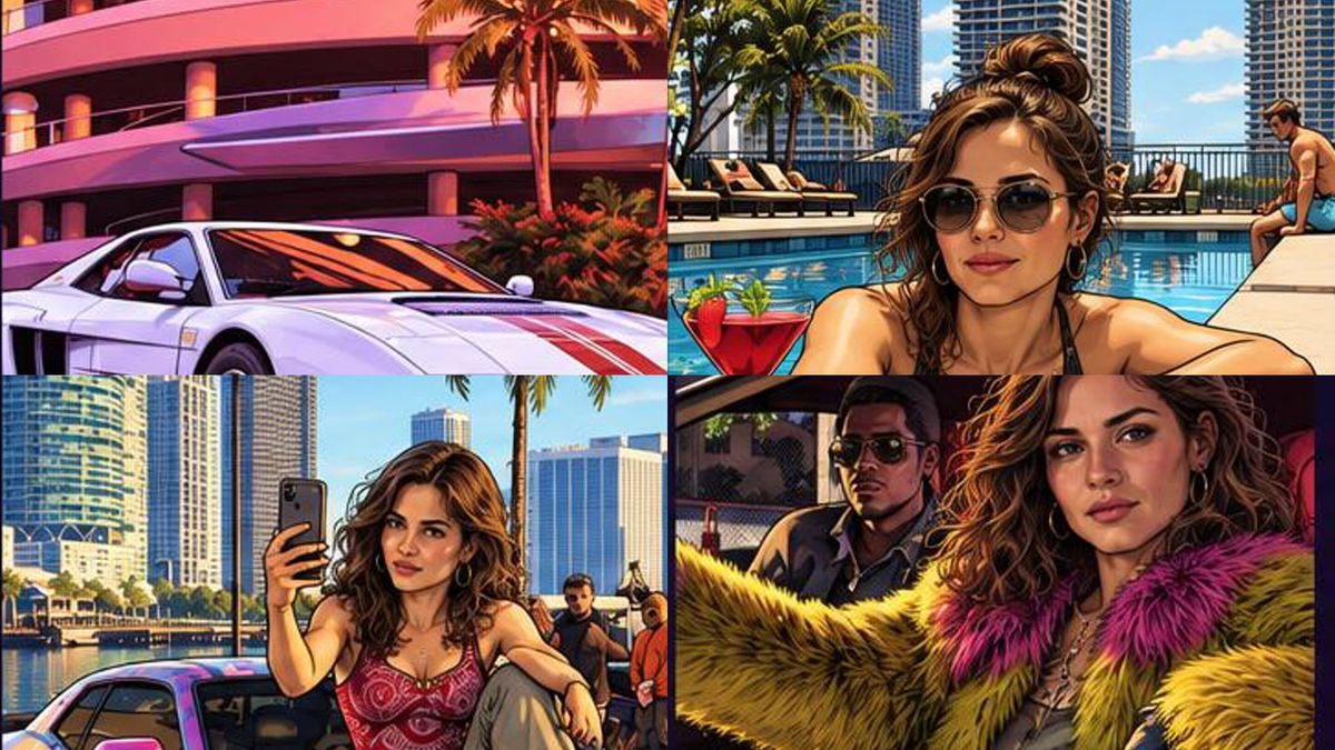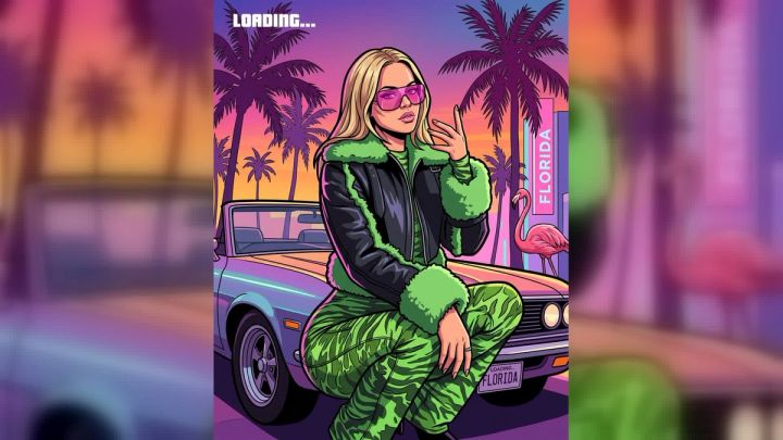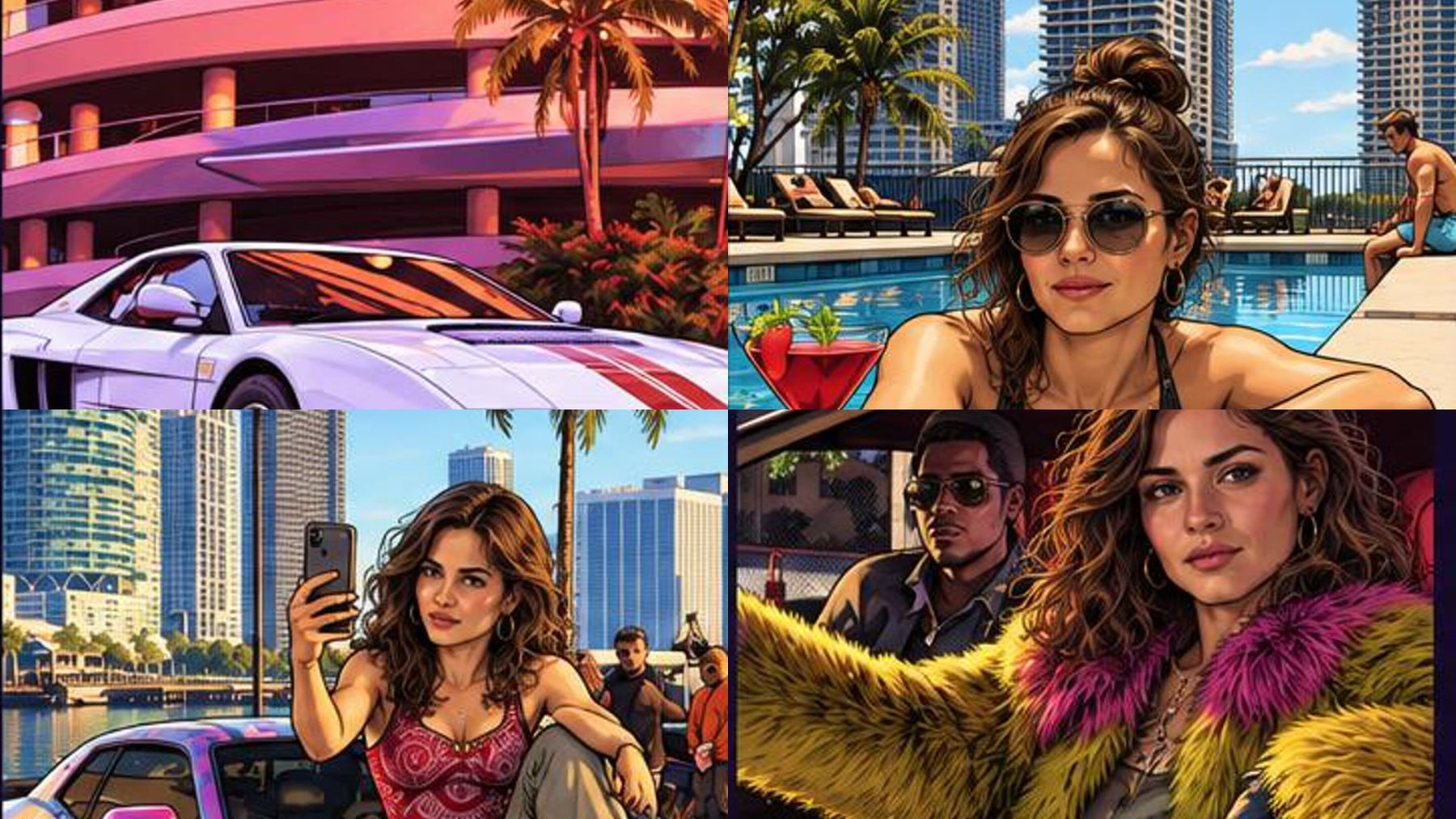
The GTA loading screen look is best described as stylized digital key art: a mix of painted illustration, crisp graphic shapes, dramatic character posing, and poster-like composition. There is no single universal technical name for it, but “comic-inspired digital painting” and “illustrated game key art” are more accurate than simply calling it a cartoon filter. If you want to explore the look with your own photo, the Vice City collage photo experience turns one portrait into a nine-panel, 16:9 composition built around that visual language.
The important distinction is intent. A loading-screen image is not just a painted portrait. It has to introduce a character, suggest a place, and imply a story in a few seconds. That is why the most convincing versions combine a clear silhouette, controlled color palette, cinematic props, and a collage that feels like a set of scenes rather than nine unrelated pictures.
The short answer: what is the GTA art style called?
There is no single formal style label that covers every loading screen, cover, and promotional illustration in the series. In everyday design language, the look can be described as:
- Stylized digital key art because it presents characters and locations as the defining visual identity of a game.
- Comic-inspired digital painting because it uses confident outlines, simplified detail, and heightened color without following the panel-and-speech-bubble structure of a comic page.
- Painterly promotional illustration because faces, clothing, vehicles, skies, and architecture are rendered rather than photographed.
- Cinematic collage art when several character and environment scenes are assembled into one poster-like composition.
People sometimes call the style “cel-shaded,” but that term can be misleading. Cel shading usually describes a rendering technique that uses distinct bands of light and shadow, often in real-time 3D graphics. Loading-screen artwork may use hard-edged shadows and simplified tones, yet it also includes blended painting, texture, rim light, and detailed illustration. “Comic-inspired digital key art” is the safer description.
Why the loading screen look is so recognizable
The style is recognizable because several design decisions repeat across the image, not because of one magic filter. A strong result usually gets five things right.
1. The character reads instantly
The lead figure has a clear pose, visible face, and simple silhouette. Clothing may be exaggerated, but it still communicates a role: nightlife regular, beach visitor, driver, performer, tourist, or fictional action lead. The pose does more storytelling than a paragraph of text.
A good source photo therefore needs more than facial sharpness. It should also make the shoulders, hairstyle, and general posture easy to read. If the image is crowded or the face occupies only a tiny part of the frame, the final illustration has less reliable identity information to work with.
2. The palette carries the location
Warm sunset pinks, violet shadows, turquoise water, electric signage, polished metal, and amber streetlights create a coastal-nightlife atmosphere. The colors are heightened rather than neutral. Even a daytime scene tends to use deliberate warm-versus-cool contrast.
You can borrow that principle without copying a specific game image. Pick two dominant color families and one accent. For example:
- Coral and violet with teal highlights
- Golden orange and deep navy with hot pink accents
- Aqua and cream with a small amount of red
- Purple and black with warm sunset light
Limiting the palette makes separate panels feel like one designed collection.
3. Each panel suggests a larger story
A car is not merely parked; it looks ready to leave. A skyline is not a generic background; it establishes scale and mood. A pool, boat, hotel, or palm-lined street acts as a story clue. Viewers connect the clues and imagine what happened before and after the frame.
This is why a successful collage mixes three types of image:
- Character panels for identity and emotion
- Environment panels for place and atmosphere
- Object or action panels for momentum
Using nine close-up portraits would feel repetitive. Using nine empty city views would lose the personal story. The contrast between panel types creates rhythm.
4. Lighting is dramatic but readable
Faces remain legible even when the environment uses saturated sunset or night colors. Highlights may be warm and shadows may lean violet or blue. Reflections on cars, water, glass, and metal add polish.
The most common mistake is pushing contrast until skin detail disappears. Another is using unrelated light directions in adjacent panels. If the face is lit from the left in one panel and from a bright, unexplained source in another, the collage can feel assembled rather than art-directed.
5. The finish is illustrated, not merely posterized
A basic posterize effect reduces the number of colors. It does not automatically create intentional line weight, believable painted hair, clean facial planes, or coherent scene design. Convincing key art combines simplification with selective detail: eyes, hair edges, jewelry, vehicle reflections, and skyline silhouettes may stay crisp while less important surfaces are broader and softer.
How the nine-panel collage is structured
The live imageat experience produces one 2048×1152 image in a 16:9 ratio. You upload one clear photo of one person and choose either the Man or Woman version. The selected person appears in four panels; the remaining panels establish the fictional coastal city through vehicles, skyline views, aircraft, water, nightlife, and other scene-setting elements.
The two versions are different preset compositions rather than a gender-analysis tool. Your selection determines which lead scenes are used. The workflow does not read private conversation history or invent facts about you. It uses the uploaded image as visual reference, and an exact likeness is not guaranteed.
Generation uses credits from a paid plan. The current cost is displayed on the Generate button before you run the workflow, so check that live value rather than relying on an older article or screenshot.
How to choose a source photo that survives four panels
One portrait has to support several illustrated situations, so source quality matters. Use this checklist before uploading.
Start with one clearly visible adult
The photo should contain one consenting adult. A group photo creates ambiguity about which face should become the lead. If another person appears in the background, reframe the picture first; the image resizer can help prepare the file for the next step.
Keep the face large enough to inspect
A head-and-shoulders or waist-up photo generally gives more useful identity detail than a distant full-body shot. The eyes, eyebrows, nose, mouth, jawline, and hairline should all be visible. Avoid heavy motion blur, extreme compression, or a face smaller than a thumbnail.
Use even, front-biased light
Soft daylight or a bright indoor window works well. Strong colored club lighting can hide eye color and skin detail. A dramatic source photo may look exciting on its own but give the transformation less neutral information.
Avoid face-blocking accessories
Large sunglasses, masks, hands across the face, and low hat brims make likeness harder to preserve. The finished collage can introduce accessories as part of the preset scenes; the source photo should prioritize identity.
Check image size without inventing detail
If the only available portrait is small, the image upscaler can improve its working dimensions before use. Upscaling cannot recover a face that is completely blurred or hidden, so inspect the result rather than assuming a larger file is automatically clearer.
A step-by-step workflow
Step 1: prepare the portrait
Choose one sharp photo with a visible face and simple background. Crop distractions and confirm that you have permission to use the image. Do not upload a stranger, public figure, or child to make a deceptive scene.
Step 2: open the collage experience
Go to the Vice City collage photo experience. Review the example outputs and the current instructions on the page before uploading, because controls and pricing can change.
Step 3: choose the preset version
Select Man or Woman based on the set of lead panels you prefer. Think of this as choosing a storyboard. It is not a judgment about the person in the source photo, and you can select whichever composition fits the fictional character you want to create.
Step 4: check the Generate button
The workflow uses paid-plan credits. Confirm the current cost shown on the Generate button. Then generate the image and wait for the completed 16:9 collage.
Step 5: inspect all nine panels
Do not judge only the largest face. Zoom in and review:
- Face consistency across the four personalized panels
- Hands, fingers, eyewear, and jewelry
- Vehicle geometry and reflections
- Small signs or accidental pseudo-text
- Repeated people or objects
- Edges where one panel meets another
If identity is weak, try a clearer, more front-facing source photo rather than repeatedly using the same difficult image.
Step 6: export for the destination
The original 16:9 output fits landscape posts, thumbnails, and video backdrops. For a vertical Story or Reel cover, create a separate crop instead of squeezing the full collage. The background remover can also help if you want to isolate a fictional illustrated character for a custom layout.
Photo and story ideas for a better collage
The preset builds the layout, but your source image and intended use still shape the result. Start with a simple character concept rather than trying to communicate everything at once.
The weekend visitor
Use relaxed styling and a friendly expression. Let the cars, skyline, water, and nightlife panels supply the cinematic energy. This concept works when you want the image to feel playful rather than confrontational.
The fictional music artist
Choose a portrait with a confident pose and distinctive wardrobe. The result can inspire a fictional single-cover or tour-poster direction, but avoid copying a real artist’s identity or official branding. If you continue the concept in the AI poster generator, add your own original title and typography outside the trend workflow.
The retro travel character
Use vintage-inspired clothing, warm colors, and simple accessories. Treat the collage as imaginary travel key art rather than a game replica. This makes the visual language useful for a personal mood board without pretending it is official artwork.
The fictional driver
A clean portrait with a direct gaze works better than uploading a photo taken inside a dark car. The preset already supplies vehicle scenes, so the source should give the model the clearest possible face.
The nightlife protagonist
Use polished but uncluttered clothing and neutral lighting. Let the generated palette create the night atmosphere. Starting with a heavily filtered club photo often compounds color casts and reduces facial detail.
Prompt starters for adjacent custom artwork
The collage experience is preset-driven, so you do not need to paste a production prompt into it. If you are developing related original art in the AI image generator, use short starters and finish the creative variables yourself:
- “Stylized coastal-city key art with a confident fictional traveler…”
- “Four-panel illustrated nightlife story with coral and violet lighting…”
- “Painterly character poster beside a retro sports car at sunset…”
- “Comic-inspired digital key art with palm-lined architecture…”
- “Cinematic travel collage with a marina, rooftop pool, and neon streets…”
Complete each starter with your own setting, camera angle, wardrobe, mood, color palette, and identity-preservation requirements. Avoid official logos, named characters, copied cover layouts, and instructions to reproduce a living artist’s exact style.
Common mistakes and how to fix them
Calling every result “cel-shaded”
Hard-edged shadows can resemble cel shading, but the overall finish may include painterly blending and textured illustration. Describe what is actually visible: graphic outlines, controlled color blocks, painted detail, and cinematic key-art composition.
Using a source photo with too many people
The workflow expects one lead person. Crop to a single consenting adult before generating.
Choosing atmosphere over facial clarity
Sunset backlight, colored LEDs, and motion blur may look dramatic but hide identity. Use a neutral portrait and let the output create atmosphere.
Treating the collage as official game art
A fan-style image is not an official asset or endorsement. Do not add publisher logos, counterfeit interface elements, or copy that implies a partnership. Keep captions clear about the image being an independent AI-made interpretation.
Publishing without checking small details
Nine panels create nine opportunities for artifacts. Check every face, hand, prop, sign, and vehicle at full size. Remove or regenerate anything that could be misleading or embarrassing.
Assuming a generation grants every usage right
Ownership of an uploaded photo does not automatically grant rights to logos, music, characters, celebrity likenesses, or third-party artwork added later. Review the current imageat terms and the rules of the platform where you plan to post. For commercial work, get appropriate legal advice rather than relying on a trend article.
How to keep the result inspired rather than copied
The safest creative approach is to borrow broad design principles, not protected identifiers. Use a fictional city, original character, custom palette, and your own story. Avoid official logos, exact title treatments, named characters, recognizable missions, or a frame-for-frame recreation of existing key art.
You can also shift the genre. The same nine-panel logic works for a coastal travel diary, fashion editorial, fictional detective story, music persona, or summer-event poster. Change the objects and emotional arc while keeping the useful structure: character, place, action, and atmosphere.
For typography questions, the separate guide to GTA-style typography explains why the franchise has used different lettering systems rather than one universal “GTA font.” Keep typography as a later layout decision; first make sure the illustration works without text.
FAQ
What is the GTA loading screen art style called?
There is no single official technical label for the entire look. “Stylized digital key art,” “comic-inspired digital painting,” and “painterly game illustration” are useful descriptions. For multi-scene layouts, “cinematic collage key art” is also accurate.
Is the GTA art style comic book art?
It borrows some comic-art traits, including clear silhouettes, simplified shapes, confident outlines, and dramatic color. However, it is promotional key art rather than a conventional comic page, and it often includes painterly rendering that goes beyond flat ink-and-color treatment.
Is it cel shading?
Not necessarily. Cel shading usually refers to distinct bands of light and shadow, often in 3D rendering. The loading-screen look may use hard-edged shading, but it can also include blended digital painting, texture, and detailed illustration.
What photo works best for a loading-screen collage?
Use one sharp, well-lit photo of one consenting adult. Keep the face unobstructed and large enough to inspect. Avoid groups, dark sunglasses, strong color casts, heavy beauty filters, and motion blur.
Does the collage use a text prompt?
The live trend workflow is preset-driven. You upload one photo and choose between the available composition versions. It produces one 2048×1152, 16:9 collage; it does not require you to write a custom prompt.
How much does it cost to generate?
Generation uses credits from a paid plan. The current cost is shown on the Generate button before you run it. Check the live page because costs and controls may change.
Can I post the result on social media?
You can prepare the image for social formats, but you remain responsible for consent, platform rules, third-party rights, and honest labeling. Do not imply that fan-style art is official or endorsed, and do not use another person’s likeness without permission.
Build the story before applying the look
The best loading-screen-inspired artwork is not defined by a filter name. It works because the character, setting, action, palette, and panel rhythm all support one fictional story. Start with a clean portrait, decide what role the person is playing, and inspect every panel before sharing.
When you are ready, open the Vice City collage photo experience, choose the composition you prefer, check the current credit cost on the Generate button, and create a clearly labeled fan-style image from a photo you have permission to use.