Square
1:1Safe in the grid.
- Shows the same crop in the feed and the profile grid
- Nothing gets cut when someone visits your profile
- Takes less vertical space, so it scrolls past faster
Images for the feed
Describe the post you need, pick a square or portrait crop, and generate a feed image with space kept clear for your words.
Original results · 1:1 and 4:5 feed formats · Download and post from the app
Made with imageat
Each post below came from the prompt shown with it. Open one in the generator and swap in your own product, palette or moment.
1:1 · Feed post
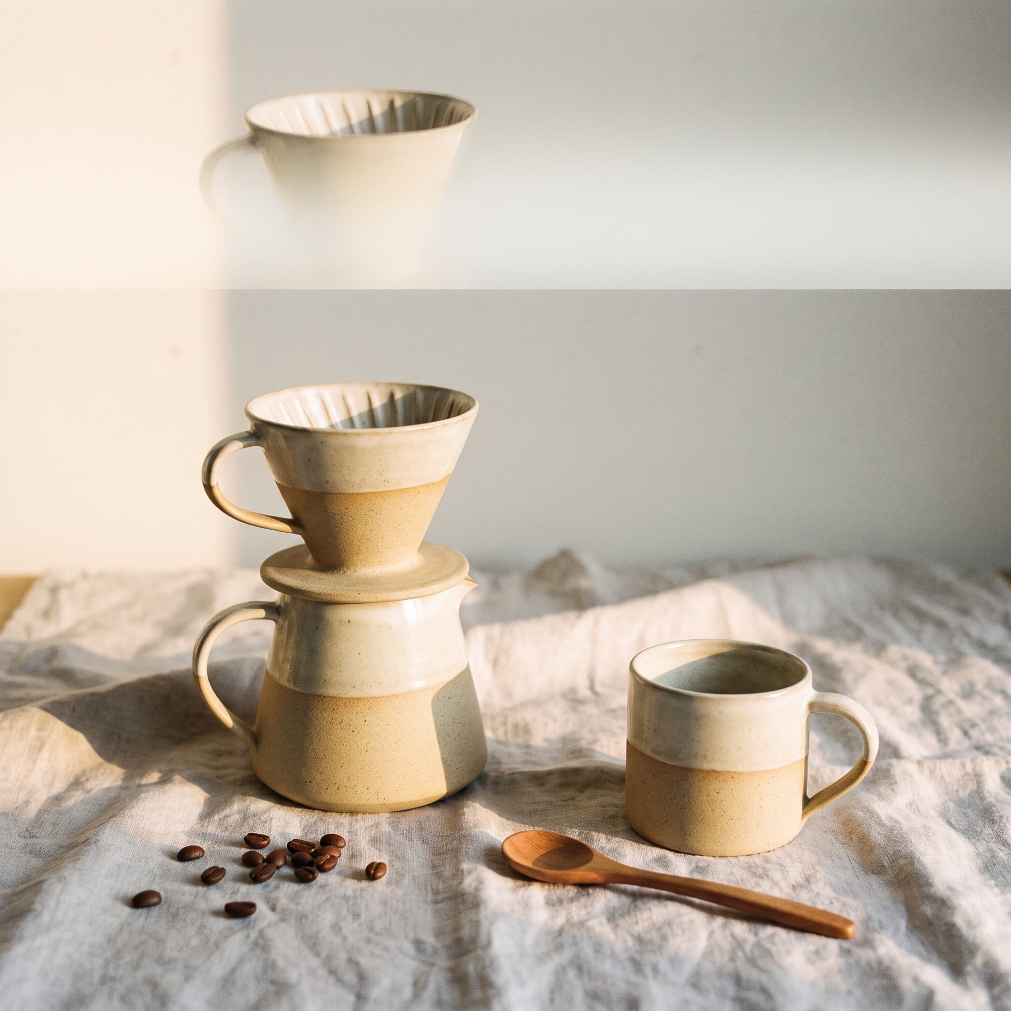
Product launch
A product shot with the top third left open for a headline.
A ceramic pour-over coffee set on a pale linen cloth, soft morning light from the left, warm minimal styling with muted sand and cream tones, product launch composition with the product as hero, generous clear space across the top third for a short headline, square social post, no text, no watermark
4:5 · Feed post
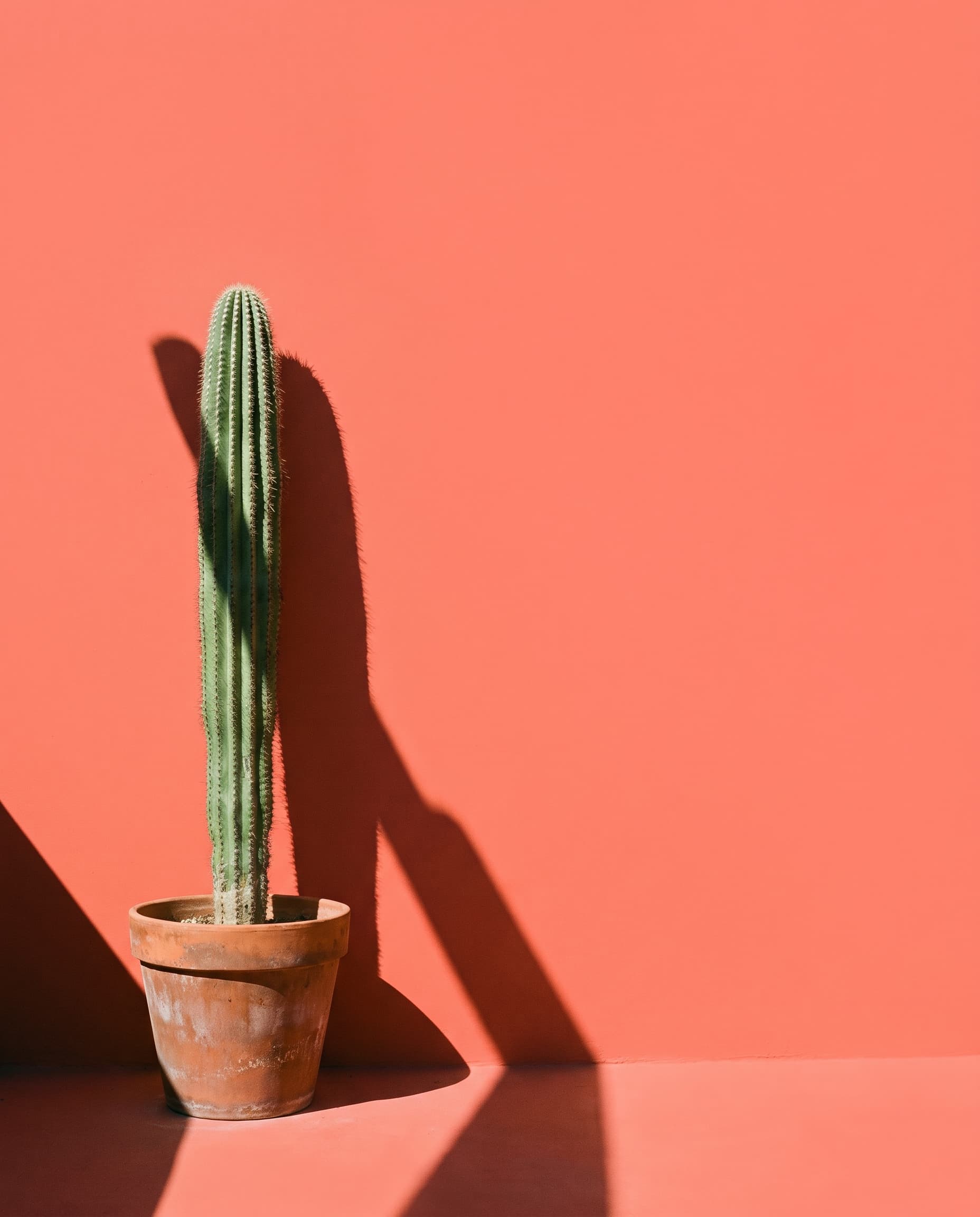
Announcement
One object, one shadow, and a lot of deliberate empty wall.
A single cactus in a terracotta pot against a flat coral wall, hard midday sunlight casting a crisp diagonal shadow, minimal graphic composition with vast negative space on the right, saturated coral and terracotta palette, vertical social post, no text, no watermark
1:1 · Feed post
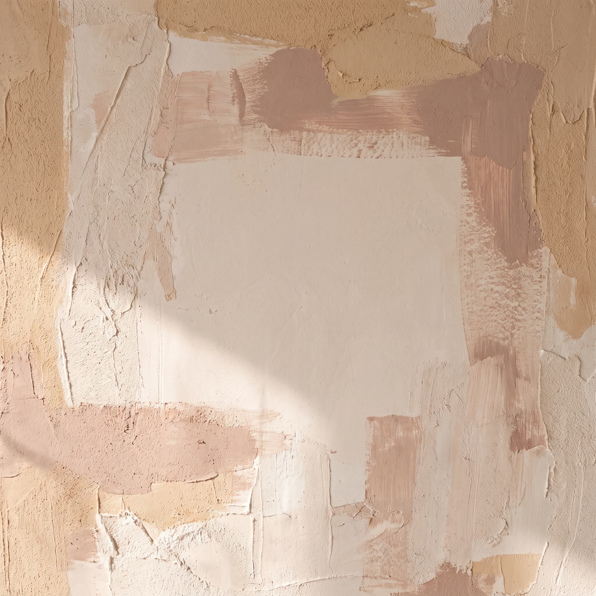
Quote
A textured backdrop built to have words set on top of it.
An abstract textured background of layered plaster and soft brushstrokes in warm sand, blush and bone tones, gentle directional light raking across the surface, large clear uncluttered area in the centre for a short quotation to be added later, square social post, no text, no watermark
4:5 · Feed post
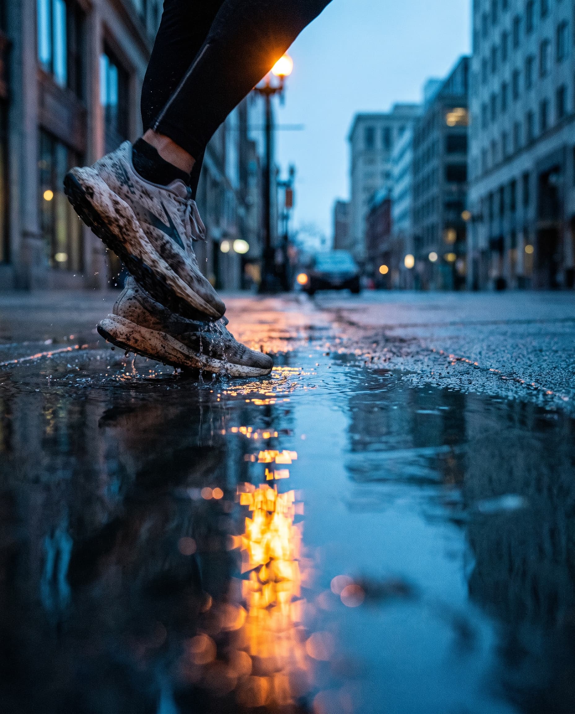
Lifestyle
Cool dawn light with one warm reflection doing all the work.
A pair of running shoes on wet city pavement at dawn, cool blue ambient light with one warm orange reflection in the water, bold energetic composition shot low to the ground, shallow depth of field, vertical social post, no text, no watermark
Square or portrait
The ratio changes the composition, not just the frame. Deciding first means you can ask for the right amount of space in the right place — rather than cropping something afterwards and losing half the subject.
Safe in the grid.
Holds the screen longer.
Keeping a grid together
A feed reads as one brand when the palette, the light and the framing stay constant and only the subject moves. Write those four things once, then reuse that half of the prompt on every post.
Three posts, one visual language
a stack of folded linen napkins
+ muted sand, bone and deep olive palette, soft window light from the left, pale linen and matte ceramic surfaces, centred subject with generous margins
a single ceramic mug beside a sprig of rosemary
+ muted sand, bone and deep olive palette, soft window light from the left, pale linen and matte ceramic surfaces, centred subject with generous margins
an open notebook with a fountain pen resting on it
+ muted sand, bone and deep olive palette, soft window light from the left, pale linen and matte ceramic surfaces, centred subject with generous margins
Where it helps
Anyone who has to keep a feed moving without a photographer on call uses the same generator for launches, quotes and everyday posts.
A clean hero shot for the day a product goes live, without booking a photographer for it.
Run one idea at 1:1 and 4:5 so the same concept works in the grid and in the feed.
Generate a textured backdrop with space kept clear, then set the words yourself.
Keep a feed active with images that match your products rather than generic stock.
Backgrounds and scene-setting images for a recognisable personal feed.
Show a client three visual directions for a campaign before any shoot is booked.
Prompt guide
Subject and setting, then the light, then the palette, then where the space should be left. That last part is what makes a post easy to add words to.
An unbranded frosted glass serum bottle standing on a wet stone slab, single softbox from the upper left with deep shadow falloff, premium product photography in a muted sage and bone palette, clear space across the top third for a headline, square social post, no text, no logos, no watermark
A bold graphic composition of stacked colour blocks in tangerine, cream and deep navy with one pair of sunglasses resting off-centre, high-contrast promotional post, flat even lighting, large clear band across the middle for a short offer line, vertical social post, no text, no watermark
A clean overhead arrangement of three coffee brewing tools spaced evenly on a pale grey surface, ordered diagrammatic composition with equal margins, soft even daylight, restrained palette, room along the bottom for a short caption, square social post, no text, no watermark
A rooftop gathering at golden hour with string lights and blurred figures in the background, atmospheric sense of occasion, warm amber and dusk blue palette, lower third kept clear and uncluttered for date and venue details, vertical social post, no text, no watermark
How it works
Say what should be in the picture and what the post is for. Naming the subject, the setting and the light gives a far better first result than adjectives alone.
Choose 1:1 for the grid or 4:5 for more height in the feed, then set a content type and a visual style so the composition suits the job.
Generate the image, download it, and add your caption or on-image text in whatever tool you already use. Asking for clear space in the prompt gives the text somewhere clean to sit.
FAQ
It turns a written description into an image sized for the Instagram feed. You describe the scene, choose what the post is for and how it should look, pick 1:1 or 4:5, and the image is generated to match — which is faster than sourcing a photo that only half fits.
No. This generates and downloads images; it does not connect to your Instagram account and cannot publish, schedule or post anything. Once you have the image, upload it through Instagram as you normally would.
4:5 takes up more vertical space in the feed, so it tends to hold attention longer. 1:1 is safer if the image also needs to look right as a square thumbnail in your profile grid. Both are supported here, and you can run the same prompt at each ratio to compare.
You can ask for text in the prompt, but AI image models still make mistakes with lettering, especially longer phrases. The more reliable approach is to ask for clear space where the text should go, then set the type yourself afterwards in any design tool — that way you control the font and the spelling.
Reuse the same wording for the things that should not change — the palette, the lighting, the level of detail and the style — and vary only the subject. Keeping that description identical across posts is what makes a grid read as one brand rather than a collection of unrelated images.
You can browse this page and open the generator without signing in, but generating an image requires an account and spends credits. The cost depends on the model and settings, and the generator shows the price before you run it. New accounts start with free credits.
Under the imageat terms of service you own the images you generate and imageat does not claim ownership of them. Commercial use still depends on your plan and on the terms, and AI output is not cleared for trademarks or likenesses, so review the terms of service for your specific case.
Both open the same image generator, but they are shaped for different placements. This page is built around feed ratios — 1:1 and 4:5 — where the image sits in a grid alongside a caption. The story generator is built for full-screen 9:16, where the interface covers the top and bottom of the frame.
imageat generates and downloads images; it does not connect to Instagram and cannot post or schedule for you. Rights and permitted use are governed by the imageat terms of service.
Describe the scene, choose the crop, and generate until the composition leaves room for whatever you need to say.